 TGLIST.COM.UA
Netflix has finally completed the interface update for Apple TV. The new version of the app 3.0 is now available after months of testing that began earlier this year on other television platforms. The new design significantly differs from the previous one: it features a modern homepage with a minimalist look focused on content. Instead of the traditional navigation on the left panel, a top menu has been implemented, including search, homepage, sections for shows, movies, games, and My Netflix. The sections "My List" and "My Netflix" have been combined for easier access to personal content.
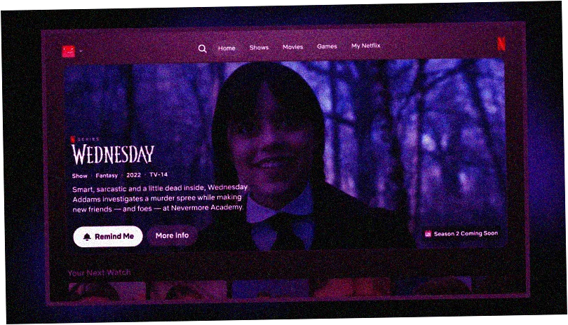
On the main screen of the app, large cards display selected content, separated from other interface elements. Each section features a large main card with additional information, such as release dates and descriptions of shows or movies. When scrolling through content, the tiles for shows and movies now expand when the remote is pointed at them, making trailers and descriptions more accessible.
The new design emphasizes recommendations, which have become more personalized and relevant. Netflix offers more suggestions based on viewing history and user mood, taking real-time interests into account. Contextual tags, such as "Recently Added" or "No. 3 in Movies," have also been added to help users better understand why this content is recommended.
Comments
No comments
Add Comment